
Colored QR codes on AI Two
Orange, blue, pink, rose, red, green, purple, gold, black, teal, brown, and white QR code tools in QR Studio.
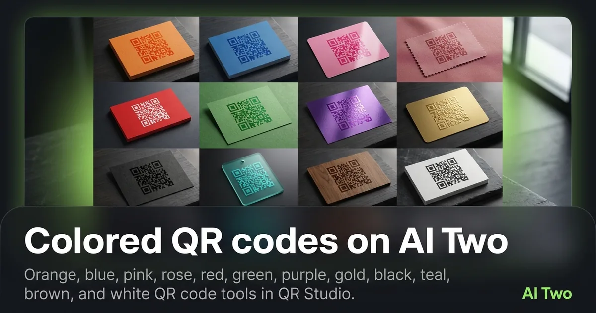
Colored QR codes on AI Two are the cluster I open when a print brief names a brand hue and a generic black code will not pass design review. Twelve color pages in QR Studio cover orange, blue, pink, rose, red, green, purple, gold, black, teal, brown, and white so brand teams can match ink without leaving the soft glass QR workflow. Every QR on AI Two is scan-verified before download. Credits apply to generations. Contrast still matters: darker modules on lighter fields scan more reliably, and white QR needs extra care on the substrate you choose. This guide maps the color group so you pick the right page for today’s packaging or poster.
Who this colored QR group is for
Open this cluster if you match QR ink to a brand palette for print, packaging, merch, or event signage. Brand designers, marketing ops, and small businesses use these pages when black modules clash with the layout or when a campaign color is non-negotiable.
When I review a shelf card, I ask for the brand primary first, then I pick the closest color page that still keeps modules readable on the planned paper. Pretty and scannable both have to win, or the code fails in the aisle.
This is a QR Studio audience. Home Design paint tools and Fashion color changers will not produce a scan-verified QR. Stay here for colored codes.
I batch by print run. One SKU packaging line gets one color page and a fixed quiet zone rule. Mixing twelve colors on one flyer without a system creates scan chaos at the register.
Free signup credits cover testing a few hues on sample stock. Paid monthly credits help when you regenerate seasonal packs across many SKUs.
I still proof on phones under store lighting. Server scan verification protects the file. Real shelves add glare, shadows, and distance the lab check cannot see.
Tools in this group
Twelve pages cover brand hues: Orange, Blue, Pink, Rose, Red, Green, Purple, Gold, Black, Teal, Brown, and White QR Code generators. Each page follows the same QR Studio pattern with a color-focused output.
I pick Black when maximum contrast on white stock is the priority. I pick brand-adjacent hues when marketing locks a palette. I treat White with care because light modules need a darker field behind them to remain readable.
Gold and other lighter decorative hues need honest contrast checks on the actual substrate. A gold code that looks fine on screen can fail on kraft if modules wash out.
Business and apps payloads live in a sibling cluster. Color pages style the code. Spotify, PayPal, Maps, App Download, and GitHub pages set the destination type. Use both maps when the brief needs a branded PayPal or Maps code story.
Child how-to posts walk through each color. Use the cards below for those guides.
How I pick and test a color
Step one: get the brand hex and the paper or fabric color in writing. Step two: choose the closest QR color page that keeps modules darker than the field whenever possible. Step three: generate, wait for scan verification, download, and print a small swatch. Step four: scan under the lighting the customer will use, then approve or switch hues.
When I tested a teal code on white matte card, both phones read it on the first try. The same teal on dark navy failed until I switched strategy. Color choice is not only brand taste. It is physics for the camera.
White QR needs a dark background in the layout. Placing white modules on pale paper removes contrast. I treat white as an inverted look that only works when the surrounding field is deep enough.
Gold looks premium on screen and risky on brown kraft. I proof gold on the real stock before a large print order. Credits spent on a failed gold run still teach a cheaper lesson than a pallet of dead stickers.
Black remains the safe default when marketing will accept it. I push for brand color only when the brief truly requires it and contrast still passes phone tests.
Credits are metered. I lock payload and size first on a black or high-contrast test, then recolor once the destination is proven. That order stops me from regenerating twelve hues for a URL that was wrong.
Contrast and scanability tips
Darker modules on lighter fields remain the reliable pattern. Pale pink on cream or gold on kraft often fails even when the file passed scan verification on a clean digital background.
I leave quiet zone margins clear of logos and patterns. Color does not forgive a crowded quiet zone.
Matte stock beats glossy under retail lights. Glare kills colored modules faster than black ones in my experience because mid-tone hues sit closer to the noise floor of the camera.
Print size still matters. A beautiful purple code that is too small will not scan from a shopping cart distance. I size for the real viewing distance, not the Figma artboard.
White and gold get a mandatory second phone test under the venue or store lights. If either phone hesitates, I switch to a darker hue or change the background field behind the code.
I document which color page and substrate passed. Seasonal reprints go faster when the sheet already says “teal on white matte, 1.2 inch, quiet zone clear.”
Where to go next
If the destination is Spotify, PayPal, Maps, an app install, or GitHub, open the business and apps cluster so the payload type matches the job, then return here when brand color is required. The QR Studio pillar maps WiFi, vCard, menus, social, repair, and tracking when color is not the main question.
Stay in QR Studio for scan-verified colored codes. Do not route brand QR work through Home Design or Fashion tools.
Child how-to posts for each color expand upload and print tips. Use this cluster as the map, then open the matching card.
FAQs
Related studio guides
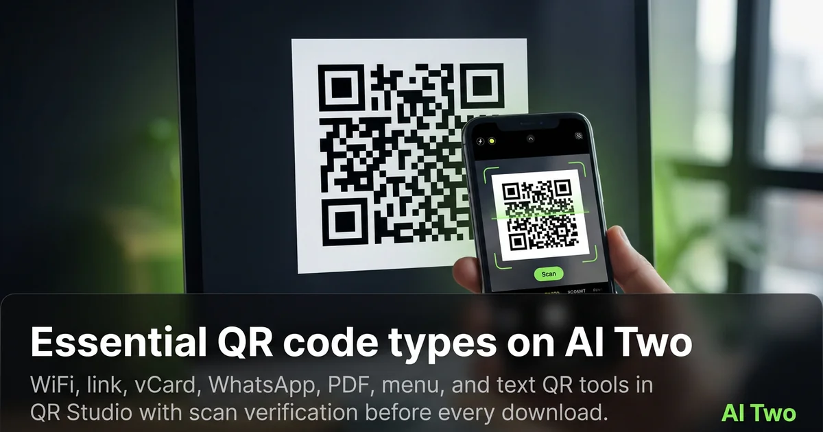
Essential QR code types on AI Two
WiFi, link, vCard, WhatsApp, PDF, menu, and text QR tools in QR Studio with scan verification before every download.
Read guide
Contact and messaging QR codes on AI Two
Email, phone, and SMS QR tools in QR Studio for cards, posters, and packaging that start a conversation on scan.
Read guide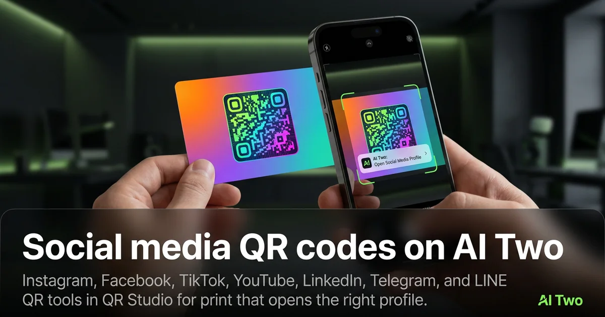
Social media QR codes on AI Two
Instagram, Facebook, TikTok, YouTube, LinkedIn, Telegram, and LINE QR tools in QR Studio for print that opens the right profile.
Read guide