
How to create a Purple QR Code on AI Two
Generate a scan verified purple QR code for print and signage. Free in QR Studio.
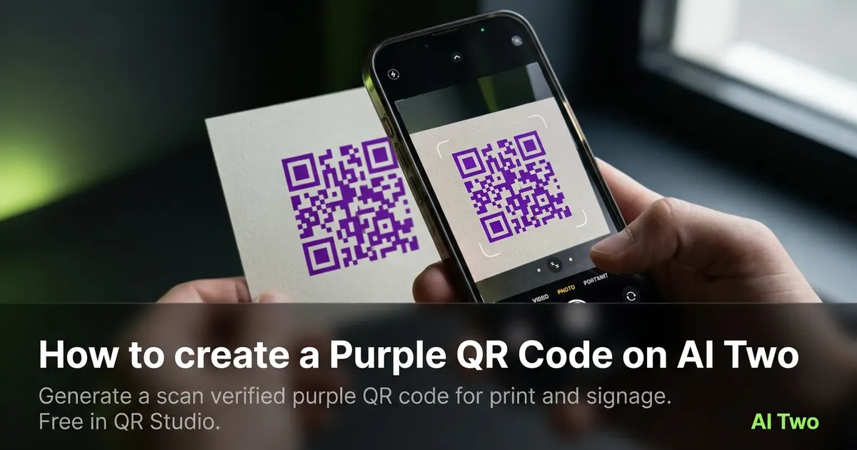
Purple QR codes on AI Two live in QR Studio colored tools. I open Purple QR Code when a beauty brand sleeve, event badge, or creative identity kit needs purple modules and I still need scan reliability on light paper. Every code is scan verified before download. When I tested deep purple modules on a white matte insert, both phones read the code under hall lights while a pale lavender sample failed on the same stock. Credits apply per generation. I lock payload and print size first, then pick purple only when the brand brief needs that hue.
What a Purple QR code does
You generate a purple module pattern for the payload type you need, with scan verification before download. Purple on a light field can work well when contrast stays strong.
When I tested deep purple versus pale lavender on white matte, deep purple won on both phones under fluorescent hall lights. Pale lavender looked soft on screen and failed on paper.
Credits apply per generation. I lock payload and size first, then pick purple only if the brand needs that hue on print.
Stay in QR Studio for colored and black generators when the job is static print codes.
I treat purple as a brand choice after black proves the payload. If black fails, color will not save a bad link.
Purple modules also help beauty, creative, and festival brands match identity kits without forcing black ink on every insert.
In my experience, a short call to action beside the code helps staff explain what the scan does at a busy booth.
Scan verification means a broken pattern never ships as a PNG. I still proof on paper under venue lights.
For packaging I note the ink name beside the filename so reprints at a new vendor match the approved sample.
How to run it step by step
Step one: know the payload type and final destination. Step two: open Purple QR Code in QR Studio. Step three: enter content, generate, wait for scan verification, download. Step four: print a small matte proof and scan with two phones.
I keep a black control sample in the same folder. If purple fails and black passes, the problem is contrast, not the payload.
Store the PNG with the payload string in the filename notes.
If marketing later demands a lighter purple, regenerate and reproof. Do not lighten modules in a layout app.
When I proofed a product launch insert, purple on white matte passed both phones before we ordered five hundred sleeves.
I note the print width in millimeters beside the filename so reprints keep the same module size.
If one phone struggles, I enlarge the art ten percent and regenerate before I touch ink color again.
I export PNG at the final print width the vendor quotes. Upscaling a small verified file in a layout app brought back scan fails for me.
Print and placement tips
Use light fields and clear quiet zones. Purple on dark plum backgrounds still fails even when it looks on brand on screen.
Matte stock reduces glare. Glossy purple can mirror hall lights into the camera.
Size for the real viewing distance, not the artboard. Table tents need bigger modules than business cards.
Proof under the venue lights you will actually use. Office monitors lie about contrast.
Leave a quiet zone free of logos and patterns. Crowding kills scans even when the file verified on screen.
I avoid hairline print sizes on kraft bags. Bigger modules win in low light.
A white sticker island on a busy pattern beats printing purple modules directly on textured stock.
Test with the same phone models your audience uses. Older cameras need bigger quiet zones than new flagships.
Place the code where thumbs naturally reach on folded stock. Corner placement on tent cards fails in the wild.
Mistakes I avoid
Skipping the two phone proof because purple looks fine on a monitor. Size and contrast still matter on paper.
Placing purple modules on busy dark photography or recycled kraft without a light island.
Recoloring modules in a layout app after download. That breaks scan verification.
Printing five hundred stickers before a two phone test on matte stock.
Saving a low resolution PNG and upscaling in the layout app. Start from the verified download at final print size.
Mixing purple QR art with heavy dither textures that eat module edges on press.
When to use another QR tool
Need maximum contrast for outdoor posters? Open Black QR Code first. Need other brand hues? Orange, pink, blue, green, and gold sibling color pages live in the colored cluster. Need WiFi or menu payloads? Essential types in QR Studio. Need repair or dynamic tracking? Fix and My QR Codes.
The colored QR cluster guide maps sibling color pages. The QR Studio pillar maps everything else.
Business deep links still need the correct payload page even when the ink is purple.
When marketing asks for pink or orange next, I keep the purple proof in the project folder as the reference scan that already passed.
After the download
I attach the verified PNG to the print vendor ticket with quiet zone notes so prepress does not crop modules.
For recurring campaigns I duplicate the same payload each quarter and only change the subject line on linked landing pages when the theme shifts.
If legal asks for an archive, I store the payload string in a text file beside the image so future staff know what the code opens.
I keep a printed proof in the event kit bag so staff can compare a failed scan against the known good sample on site.
When a scan fails at the venue, I enlarge ten percent and regenerate before I blame the phone camera.
FAQs
Related studio guides
How to create an Orange QR Code on AI Two
Generate a scan verified orange QR code for print and signage. Free in QR Studio.
Read guide
How to create a Blue QR code on AI Two
Generate a scan verified blue QR code in QR Studio when your brand needs blue modules and strong print contrast.
Read guide
How to create a Pink QR Code on AI Two
Generate a scan verified pink QR code for print and signage. Free in QR Studio.
Read guide