Yes. Describe a scheme in plain English ("sage green body, cream trim, walnut door") and the render applies it to your photo as a set, or use the Colour Combination AI to get coordinated body-trim-accent palettes proposed for your house style and roof colour first, then render the ones you like here. Judging combinations on your real elevation is the whole point — three colours that work on a chip card can disagree on a full facade.
AI Exterior House Paint & Colour Combination Generator – Paint My House Free
AI Exterior House Paint & Colour Combination Generator – Paint My House Free is a free AI tool. AI house paint visualizer — upload a photo, try exterior paint colours and full colour combinations on your real house. Free to try, results in about 30 seconds.
Free to try · first generation free on signup · no credit card
1
Step 1
Upload Image
Start by uploading image
Upload your image
Click to browse or drag & drop
2
Step 2
Select Mode
Choose your transformation style
Advanced AI-powered paint visualization with masking support
3
Step 3
Options
Configure your options
Output quality:
Mode
Best AI Painter
Your AI Design Will Appear Here
Fill in the options on the left, then press Generate.
Upload your image
Drag & drop your file here or click to browse
JPG, PNG, WebP
Max 10MB
AI Ready
Popular in Home Design Studio
AI Kitchen DesignAI Bathroom DesignAI Bedroom DesignFree AI Architecture GeneratorAI Interior Design From a PhotoAI Landscaping DesignHome Color Combination AIAI Curb Appeal RaterAI Interior Design RaterAI House Style IdentifierAI Renovation Cost EstimatorAI Day to Dusk Photo EditingAI Declutter Room PhotosAI Home Addition VisualizerAI Home Design Tools Compared
Quick facts about AI Exterior House Paint & Colour Combination Generator – Paint My House Free
- Tool nameAI Exterior House Paint & Colour Combination Generator – Paint My House Free
- CategoryHome Design
- PriceFree to try
- InputPhoto upload + text prompt
- OutputAI-generated image
Before / After
Example results
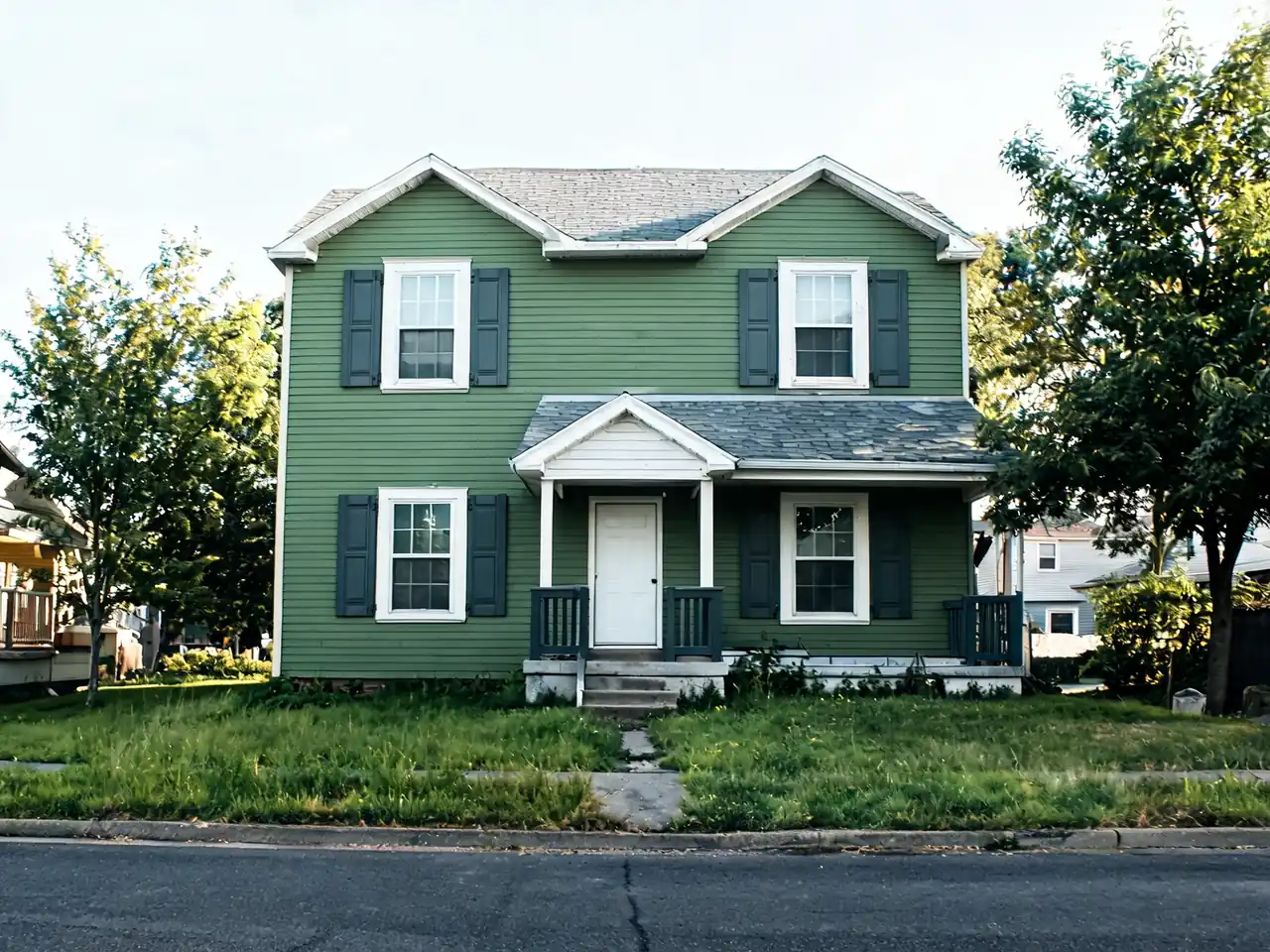
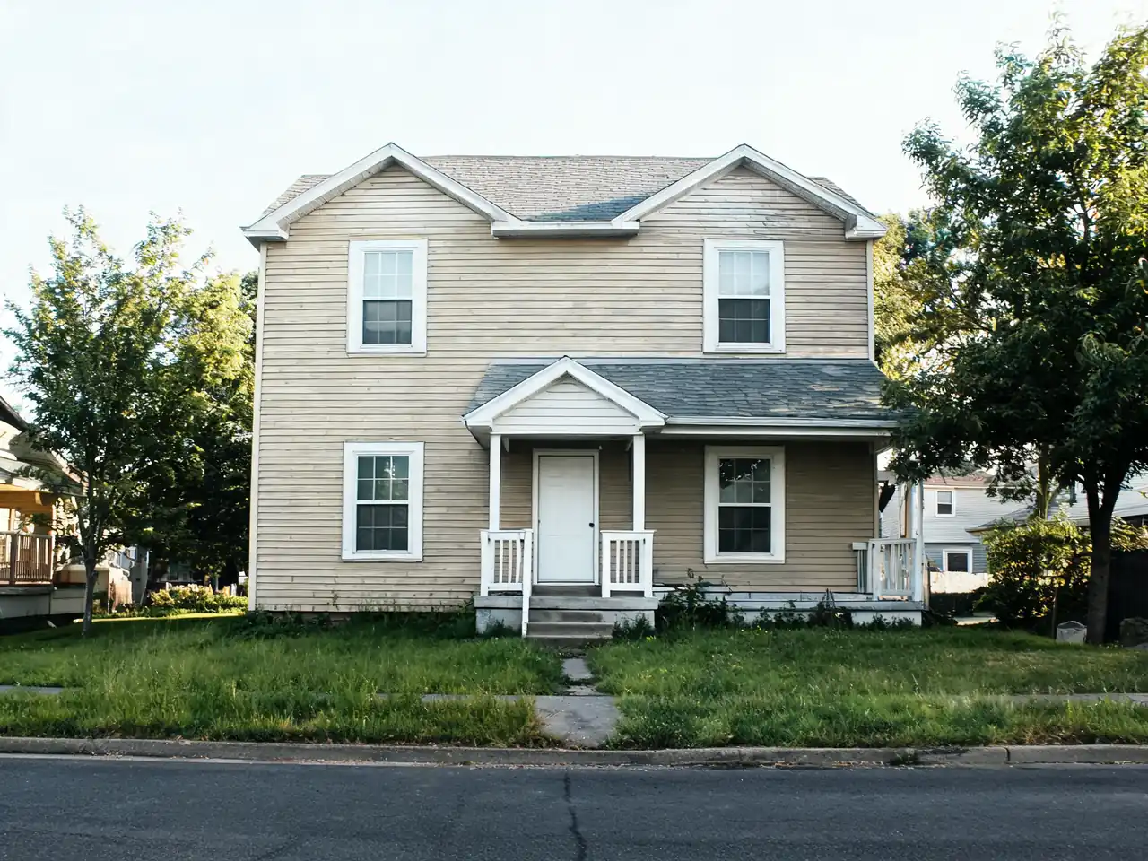
Drag to compare


Drag to compare
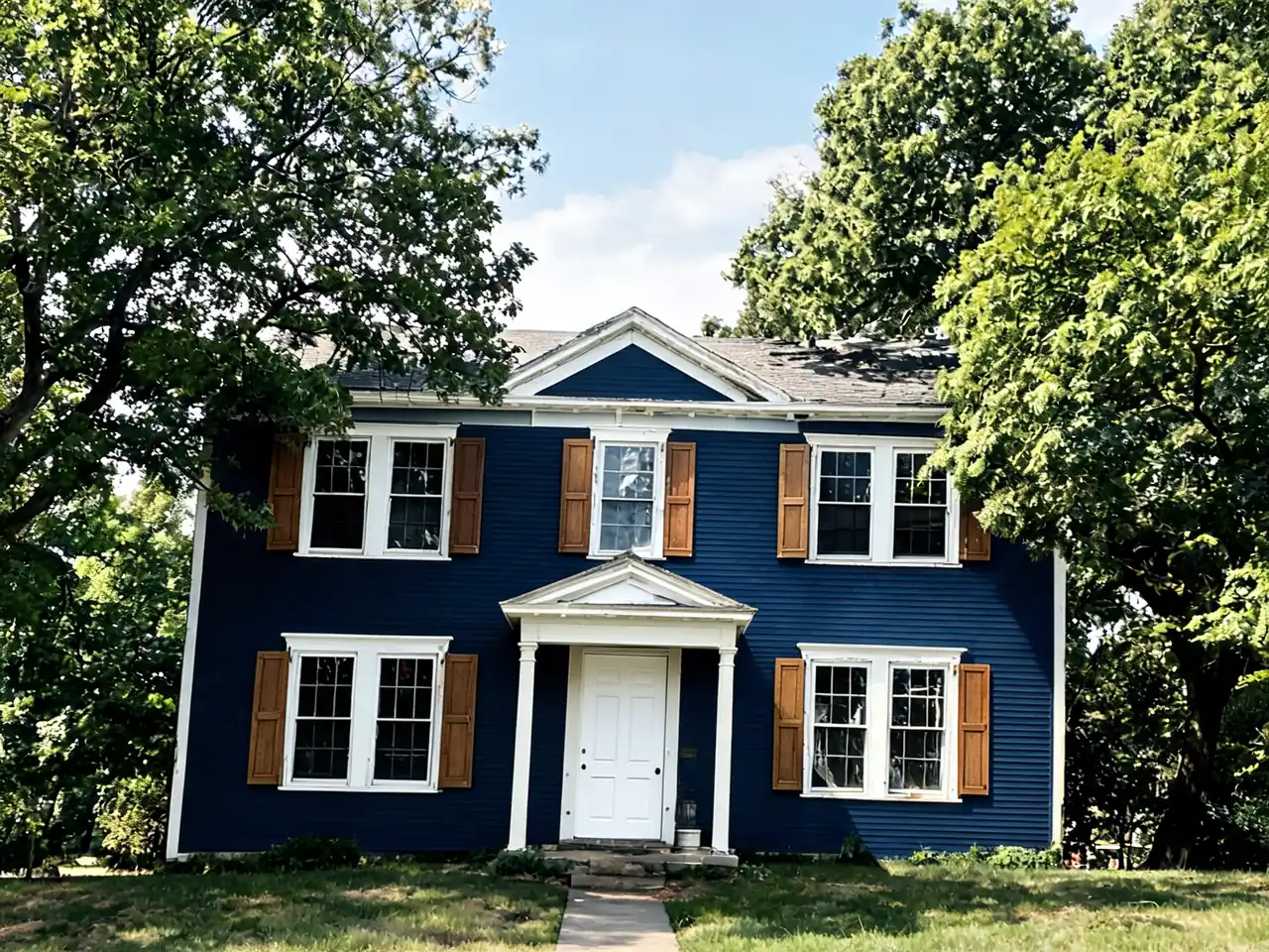

Drag to compare
Real, unretouched output from this tool. Drag any slider to compare.
Repainting a house is a five-figure decision usually made from a paint chip the size of a business card. This puts the colour on your actual walls first.
Free to try · results in about 30 seconds · no credit card
How AI exterior house painting actually works
The tool starts from the photo you upload rather than from a generic house. It reads the elevation in that image — where the walls meet, where the windows and door sit, how the light falls across the facade — and re-renders only the painted surfaces inside that same frame. The roof stays your roof, the brick stays your brick, the shrub in front of the porch stays exactly where it is.
That is the whole point, and it is what separates a useful preview from a mood board. A stock image of a grey house tells you that grey houses can look good. A render of your house in that grey tells you whether it works against your particular roof colour, your stone, your window frames and the light your street actually gets. Those four things are why the same colour can look expensive on one house and cheap on the one next door.
Because it works from a photo, there is nothing to set up. No measurements, no 3D model, no elevation drawing, no plugin. A phone photo taken from across the road is enough, and most people have one already.
Choosing an exterior colour that works on your house
Exterior colour is mostly a problem of context. Inside, a wall colour has to work with your furniture, which you can change. Outside, it has to work with a roof you are not replacing, masonry you cannot repaint, a driveway, mature planting, and whatever the houses either side are doing. Those constraints do more to rule colours out than taste does.
The roof is the biggest one. A brown or terracotta roof pushes you towards warm bodies — creams, greiges, muted greens — and fights cool blue-greys badly. A grey or black roof does the opposite and gives you the whole cool range. Brick or stone that stays exposed sets the undertone for everything else, and a body colour whose undertone disagrees with it reads as a mistake even when nobody can say why.
The practical method is to test in schemes rather than single colours. Body, trim and door work as a set: a body colour that looks flat on its own often comes alive with the right trim, and a strong door colour can carry a conservative body. Generate three complete schemes, look at them the next morning rather than deciding at midnight, and you will usually find one is obviously right.
If you want a starting point rather than a blank box, the Colour Combination AI produces palettes that hold together for a given house style and roof, and the House Style Identifier will tell you what architectural language your house is speaking — which is usually the difference between a repaint that looks intentional and one that looks like a fashion applied to the wrong building.
Home exterior colour combinations that work
A colour combination is three decisions made together: the body, the trim, and one accent — usually the front door. Schemes fail when the three are chosen separately, which is why the tool asks for them as a set and renders them as a set. Type the combination in plain English ("greige body, bright white trim, black door") or pick swatches, and judge the whole scheme on your own photo rather than imagining how three chips will add up.
Some combinations earn their popularity. On a grey or black roof: white body with black trim and a natural-wood door; light grey with charcoal trim and a yellow or red door for contrast; deep navy with crisp white trim. On a brown or terracotta roof: cream with olive-green shutters; warm greige with off-white trim and a walnut door; muted sage with cream trim. Red brick that stays exposed likes white, cream or deep green paint beside it and fights orange-undertone beiges. These are starting points to render, not rules — the same navy that looks stately on a two-storey colonial can make a small ranch look like a shipping container, and the render will tell you which house you have.
Contrast is the other lever. High contrast (light body, dark trim, or the reverse) sharpens architectural detail and suits houses with good bones — gables, window casings, porch columns worth pointing at. Low contrast (body and trim within two shades) hides awkward details and makes small houses read larger and calmer. If your house has features you would rather not emphasise, run a low-contrast scheme first and you will usually be surprised how much tidier the elevation looks.
If you would rather be handed complete schemes than assemble them, the Colour Combination AI takes the same photo and proposes coordinated body-trim-accent palettes for your house style and roof colour, which you can then render here one by one. Between the two tools you can go from "no idea" to two or three defensible schemes in a few minutes, free.
What the render can tell you, and what it cannot
A render is a decision aid, not a paint sample, and it is worth being precise about where the line falls. What it is genuinely good at: relative comparison. Whether this scheme is better than that one on your house, whether the trim should be white or off-white, whether a dark body makes your house look grounded or squat. That is the question most people actually have, and seeing it on the real elevation answers it far better than a chip.
What it cannot do is give you a colour-accurate match. Screens are not calibrated, your photo carries its own white balance, and the render is an interpretation rather than a measurement. Sheen is invisible here too — the same colour in matte and satin behaves completely differently in sunlight, and satin will show every imperfection in old render or lap siding that matte hides.
Paint also shifts outdoors in ways no preview captures. Exterior colour reads roughly two shades lighter and more saturated on a full wall than on a card, north-facing walls go cooler and greyer, and a colour chosen under a bright afternoon sky can look muddy on an overcast morning. The workflow that actually works is: narrow it down to two schemes here, then buy sample pots of those two, paint a metre square on the wall that gets the least light, and look at it at three different times of day before ordering.
None of that makes the preview less useful. It makes it the first step instead of the only one — and it saves you buying eight sample pots to eliminate seven colours you could have ruled out on screen in a minute.
Beyond paint: the rest of the exterior
Paint is often not the only thing being decided. If the roof is due for replacement in the same project, the Roof Visualizer previews materials and colours on the same photo, and it is worth doing before the paint choice rather than after, because the roof constrains the body colour rather than the other way round.
The same applies to the front door, the windows and the driveway — each has its own visualiser, and each changes how a paint scheme reads. For bigger changes, where the question is not the colour but the cladding, the massing or an extension, House Design AI remodels the facade itself and the Home Addition Visualizer puts an extension or second storey on your actual house. And if the project is a new building rather than a repaint — a sketch, an elevation, an empty plot — the AI Architecture Design generator renders it photorealistically before anything is built.
If you are preparing to sell rather than to live, run the finished exterior through the Curb Appeal Rater. It scores the front of the property and lists the fixes in priority order, which frequently reveals that the paint was not the highest-return item on the list — cheap, fast wins like clearing the path, replacing a tired door or cutting back overgrown planting often move a listing more than a full repaint does.
More AI tools for your home exterior
Colour Combination AICurb Appeal RaterRoof VisualizerFront Door VisualizerWindow Replacement VisualizerAI Home Exterior DesignFront Elevation Maker — create a front elevation design onlineDriveway Design AIRenovate AI — whole-home remodelAI Architecture Design & Rendering — sketch to renderAI Landscaping & Garden Design
🎨
AI Exterior House Paint & Colour Combination Generator – Paint My House Free
Upload your imageTap anywhere here — your AI design will appear in this space after you generate.JPG · PNG · WebP
Advanced AI-powered paint visualization with masking support
Premium users can generate images without watermark
Higher quality options available for premium users
Select the architectural style of your building
Describe your desired color scheme in detail, or tap a swatch below to add a named color
Choose the lighting conditions for the visualization
Output quality:
Frequently Asked Questions
It depends mostly on your roof and any exposed masonry. Grey or black roofs open up the cool range: white with black trim, light grey with charcoal, or deep navy with white. Brown and terracotta roofs want warm bodies: cream with olive shutters, greige with off-white trim, muted sage. Exposed red brick pairs well with white, cream or deep green and clashes with orange-undertone beiges. Render two or three of these on your own photo — the roof and brick in your picture will rule schemes in or out faster than any theory.
You can paint my house virtually free using our AI house painter tool. Simply upload a photo of your home exterior, select your desired paint colors, and our AI paint visualizer generates a realistic preview in about 30 seconds. This free house paint visualizer lets you try color combination after color combination before buying any paint, helping you virtually paint your house exterior free of charge.
An AI house painter is an intelligent tool that uses artificial intelligence to visualize paint colors on your home. Our AI house painter analyzes your uploaded photo, identifies architectural features like walls, trim, doors, and shutters, then applies your chosen colors realistically. The exterior paint visualizer considers lighting, shadows, and textures to show exactly how paint will look on your house.
Yes! You can virtually paint your house exterior free with our AI paint visualizer. Upload any exterior photo of your house, and the house colour visualizer will let you experiment with different color schemes at no cost. Our free exterior paint visualizer helps homeowners make confident paint decisions without spending money on samples.
The render reads the lighting, surface textures and architectural details in your photo and applies colour to the painted surfaces only, so it is a strong guide for comparing schemes on your actual house. It is not a colour-accurate paint match — screens vary and photos carry their own white balance — so use it to narrow down to two schemes, then confirm with sample pots on the wall before ordering paint.
Our house colour visualizer uses advanced AI technology that goes beyond simple color overlays. Unlike basic paint my house apps, our AI house painter understands architectural elements and applies colors appropriately to each surface. The virtual paint my house tool distinguishes between siding, trim, doors, and accents, so each surface gets its own colour the way a real paint job would.
Yes! Our AI paint visualizer offers selective painting modes. You can paint my house completely or focus on specific areas like trim, doors, shutters, or accent walls. The AI house painter includes masking technology that lets you virtually paint your house exterior with different colors for each architectural element, giving you complete creative control.
For the best paint my home results, upload a clear photo taken in good daylight showing the full exterior of your house. The AI house painter works best with photos that clearly show architectural details. Include the areas you want to paint in the frame, and the exterior paint visualizer will generate realistic color previews. Try multiple color combinations and compare them before choosing a scheme.
Our exterior house paint AI works with all architectural styles including Victorian, Colonial, Modern, Craftsman, Tudor, Ranch, Cape Cod, Farmhouse, Mediterranean, and more. Whether you want to paint my house in traditional or contemporary colors, the AI paint visualizer adapts to any building type and provides accurate visualizations.
Yes! When you paint my house virtually with our tool, you can generate multiple color variations and compare them side by side. The house colour visualizer lets you save your favorite combinations, making it easy to share with family or contractors. This feature helps you confidently decide before you paint my home exterior.
Our AI house painter generates paint visualizations in approximately 30-60 seconds. Upload your photo, select colors, and the exterior paint visualizer shows how the colors will look on your house. You can virtually paint your house exterior multiple times in a session, comparing several color combinations before you decide.
Yes — a rendered preview on the client's own house is a stronger proposal exhibit than colour chips, and it settles scheme discussions before the ladder goes up. Contractors can run several schemes from one photo and put the client's favourite alongside the quote, which reduces mid-job colour changes and post-job disappointment.
Our house colour visualizer accepts all common image formats including JPG, PNG, WebP, and HEIC. For best results when you paint my house virtually, use high-resolution photos at least 1024x768 pixels. The AI house painter automatically optimizes your images for the most accurate exterior paint visualizer results.