How to create a Red QR Code on AI Two
Generate a scan verified red QR code for print and signage. Free in QR Studio.
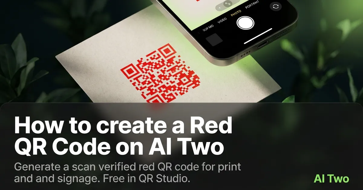
Red QR codes on AI Two live in QR Studio colored tools. I open Red QR Code when a sale banner, food sleeve, or bold brand kit needs red modules and I still need scan reliability on light paper. Every code is scan verified before download. When I tested red modules on white matte beside a dark charcoal footer band, both phones read the code under store lights. The same file on a black background failed until I moved the code to a white sticker island. Credits apply per generation. I lock payload and print size first, then pick red only when contrast on the final background is already planned.
What a Red QR code does
You generate a red module pattern for the payload type you need, with scan verification before download. Red on a light field can work well when contrast stays strong.
When I tested deep red versus orange red on white matte, deep red won on both phones under bright retail lights. Orange red looked fine on screen but needed a larger quiet zone on small stickers.
Credits apply per generation. I lock payload and size first, then pick red only if the brand needs that signal on print.
Stay in QR Studio for colored and black generators when the job is static print codes.
I treat red as a brand choice after black proves the payload. If black fails, color will not save a bad link.
Red modules help retail, food, and sports brands match identity kits without forcing black ink on every insert.
Dark backgrounds need extra care. Red on black or navy often fails even when it looks dramatic on a monitor.
Scan verification means a broken pattern never ships as a PNG. I still proof on paper under install lighting.
For packaging I note the ink name beside the filename so reprints at a new vendor match the approved sample.
How to run it step by step
Step one: know the payload type and final destination. Step two: open Red QR Code in QR Studio. Step three: enter content, generate, wait for scan verification, download. Step four: print a small matte proof on the real background color and scan with two phones.
I keep a black control sample in the same folder. If red fails and black passes, the problem is contrast, not the payload.
Store the PNG with the payload string in the filename notes.
If marketing later demands a lighter red, regenerate and reproof. Do not lighten modules in a layout app.
When I proofed a sale poster, red on white matte passed both phones before we ordered window clings.
I note the print width in millimeters beside the filename so reprints keep the same module size.
If one phone struggles, I enlarge the art ten percent and regenerate before I touch ink color again.
Each generation uses credits and usually finishes in about 30 seconds. Free signup credits covered several proofs for me before a paid plan raised monthly limits for a retail drop.
Print and placement tips
Use light fields and clear quiet zones. Red on dark charcoal or black backgrounds often fails unless you print on a white sticker island.
Matte stock reduces glare. Glossy red can mirror store lights into the camera.
Size for the real viewing distance, not the artboard. Window posters need bigger modules than shelf tags.
Proof under the venue lights you will actually use. Office monitors lie about contrast on dark art.
Leave a quiet zone free of logos and patterns. Crowding kills scans even when the file verified on screen.
I avoid hairline print sizes on dark bands. Bigger modules win when the background is not pure white.
A white rectangle behind the code on a red sale banner beats printing red modules directly on photography.
Test with the same phone models your audience uses. Older cameras struggle most on low contrast red fields.
Place the code away from busy texture. Brick walls and dark wood need a light patch for reliable scans.
Mistakes I avoid
Skipping the two phone proof because red looks fine on a monitor. Dark backgrounds change everything on paper.
Placing red modules directly on black or navy art without a white island.
Recoloring modules in a layout app after download. That breaks scan verification.
Printing five hundred stickers before a two phone test on the final background color.
Saving a low resolution PNG and upscaling in the layout app. Start from the verified download at final print size.
Mixing red QR art with heavy dither textures that eat module edges on press.
When to use another QR tool
Need maximum contrast on dark art? Open Black QR Code on a white island first. Need a softer warm hue? Rose or Orange QR Code. Need cooler brand color? Blue or Pink QR Code. Need WiFi or menu payloads? Essential types in QR Studio.
The colored QR cluster guide maps sibling color pages. The QR Studio pillar maps everything else.
Business deep links still need the correct payload page even when the ink is red.
When marketing asks for gold or green next, I keep the red proof on white in the project folder as the reference scan that already passed.
After the download
I attach the verified PNG to the print vendor ticket with quiet zone notes and a note about the background color.
For retail windows I schedule a morning scan test after install when sun angle matches peak foot traffic.
If marketing rotates campaigns monthly, I date the filename and retire old clings so staff do not post outdated links.
I keep a screenshot of the live destination beside the PNG in the project folder for quick audits when a scan report comes in.
When a scan fails on dark art, I move the code to a white patch and regenerate before I blame the phone camera.
FAQs
Related studio guides
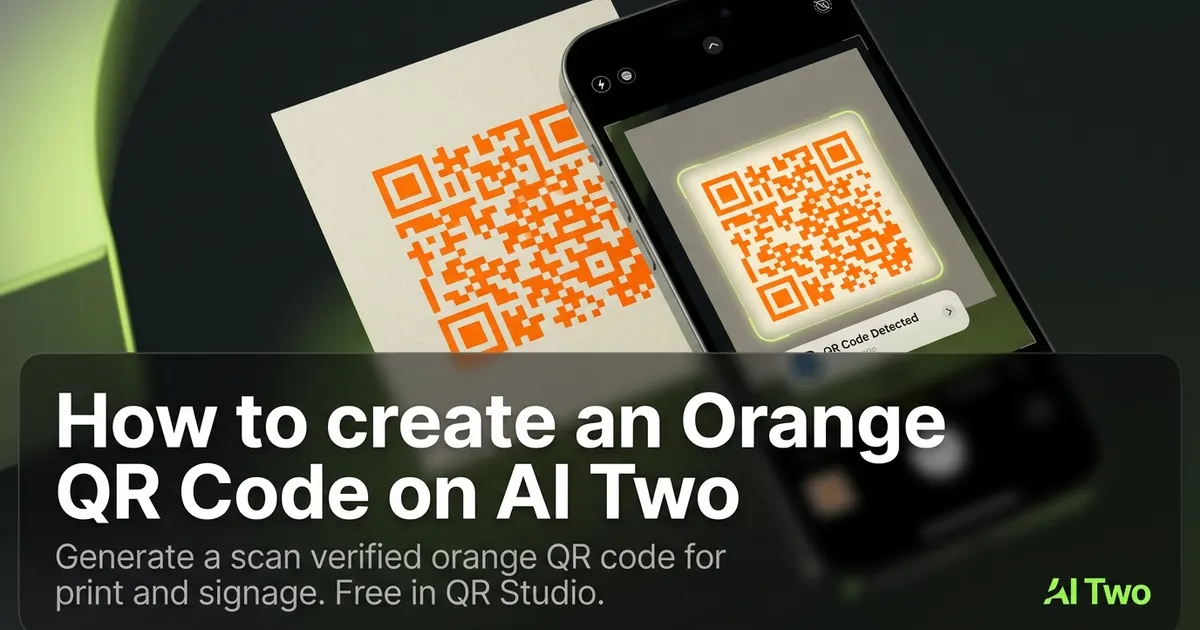
How to create an Orange QR Code on AI Two
Generate a scan verified orange QR code for print and signage. Free in QR Studio.
Read guide
How to create a Blue QR code on AI Two
Generate a scan verified blue QR code in QR Studio when your brand needs blue modules and strong print contrast.
Read guide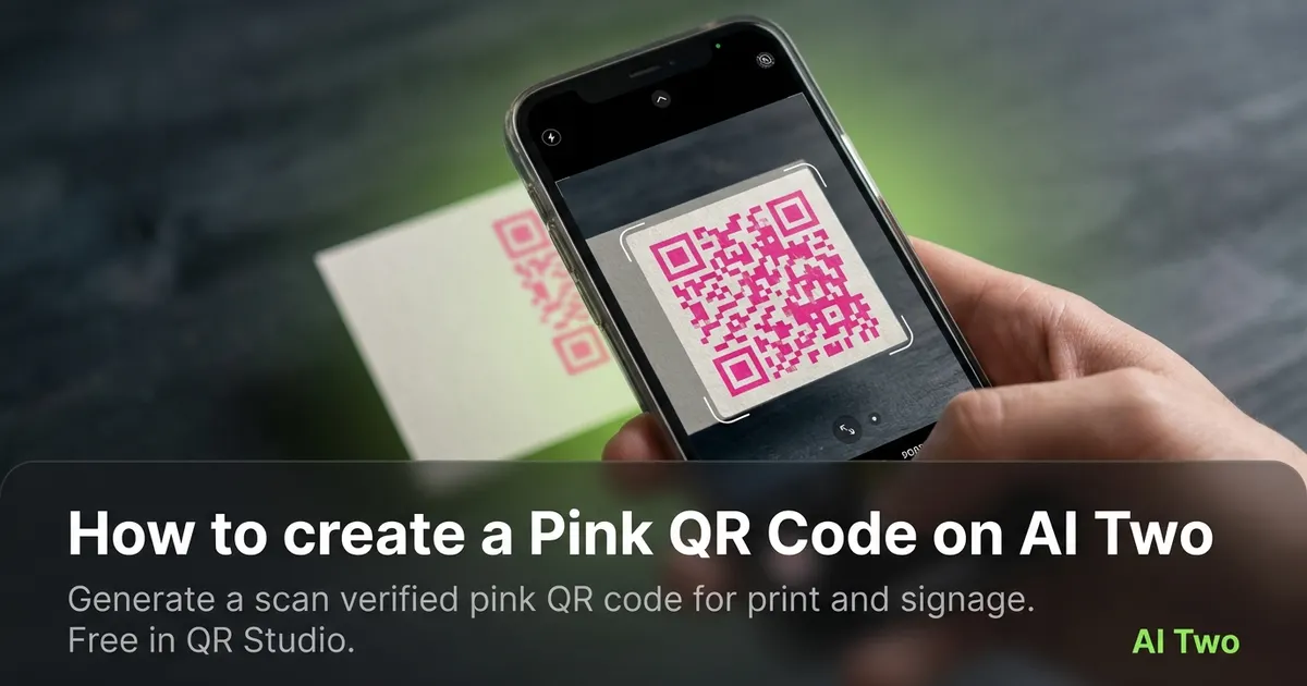
How to create a Pink QR Code on AI Two
Generate a scan verified pink QR code for print and signage. Free in QR Studio.
Read guide